Friday, 28 September 2012
Inspiration
If the text on this presentation is difficult to read, please click on the link below to view it through SlideShare.net

Wednesday, 26 September 2012
Reflections on research
Although from the existing artists of silmiar genres I found that most have very basic styles and branding, I would like my artist to have a much more "pop" style. I'd like to ditract from her existing garage style and head towards the girly side of her music as I think this better suits the song. I think this will be easy to do as I agree with Robert Stam's theory that genre doesn't exist, that it's an invented concept that we can manipluate through taking conventions of others in the genre, opposingly supporting Rick Altman's theory that everything in one genre looks the same so trying to make sure mine looks like other pop videos.

This is her existing album cover. Although this simplicity of the cover clearly fits into the garage style like other garage artists, I'd like to make her look more like a pop artist by: changing the way she dresses, I don't think she looks girly enough in this photo, by changing the way that her name is written, this font is boring, and by including more colours as I think her song is alot more lively and bold than this cover makes it seem.
Instead I am going to look at some existing pop artists and how they promote and brand themselves for ideas of how to design my digipak, poster and video model.

This is her existing album cover. Although this simplicity of the cover clearly fits into the garage style like other garage artists, I'd like to make her look more like a pop artist by: changing the way she dresses, I don't think she looks girly enough in this photo, by changing the way that her name is written, this font is boring, and by including more colours as I think her song is alot more lively and bold than this cover makes it seem.
Instead I am going to look at some existing pop artists and how they promote and brand themselves for ideas of how to design my digipak, poster and video model.
Tuesday, 25 September 2012
Target Audience
When I looked into the genre that Katy B is associated with, I found the most commonly mentioned were UK garage, house and R&B. To get ideas about how to brand my artist and song for this project, I looked at other artists of the same genre that would have a similar target audience in order to see what it is that makes them sucessful and what techniques they use to appeal to this audience.
Someone that I always compare to Katy B due to their similar style is Disclosure, their style of music is very similar to hers in the way that it is also garage house music and I think fans of them would also like Katy B.
 I like their album cover for their version of coconuts and think I can take inspiration from this as I would also like to use bright colours and doodle-like shapes on my digipak. The face outline is actually Disclosures logo. This logo can be seen on all of their merchandise and I think it's very effective as a branding technique as it is very recognisable.

What I like about this album cover is that it is so simple; one colour, artist, title, and their logo. I think that simple is very fashionable at the moment and modern. I also consider it being very arty as it does not stick to the usual albums on the market, most including a photo and bold fonts and colours. I'd like mine to be arty too as I think that most artists of this genre are considered unique too but I know that bright colours are alot more girly and I'd like my artist to have a girly style.

 Another artist that I think would have a similar target audience to Katy B is The Streets, a UK garage group. The Streets is made up of londoners whose brading is largely based around that fact. They include lots of images of London and build up areas like it and have even named their band after the areas that they and their style of music are associated with; "the streets".
This album cover (right) includes two bright colours but the rest is simple. The band also have a logo that represents their style of music as is a very urban object that is often seen on the streets.
Someone that I always compare to Katy B due to their similar style is Disclosure, their style of music is very similar to hers in the way that it is also garage house music and I think fans of them would also like Katy B.
 I like their album cover for their version of coconuts and think I can take inspiration from this as I would also like to use bright colours and doodle-like shapes on my digipak. The face outline is actually Disclosures logo. This logo can be seen on all of their merchandise and I think it's very effective as a branding technique as it is very recognisable.
What I like about this album cover is that it is so simple; one colour, artist, title, and their logo. I think that simple is very fashionable at the moment and modern. I also consider it being very arty as it does not stick to the usual albums on the market, most including a photo and bold fonts and colours. I'd like mine to be arty too as I think that most artists of this genre are considered unique too but I know that bright colours are alot more girly and I'd like my artist to have a girly style.

 Another artist that I think would have a similar target audience to Katy B is The Streets, a UK garage group. The Streets is made up of londoners whose brading is largely based around that fact. They include lots of images of London and build up areas like it and have even named their band after the areas that they and their style of music are associated with; "the streets".
 This album cover (right) includes two bright colours but the rest is simple. The band also have a logo that represents their style of music as is a very urban object that is often seen on the streets.
Monday, 24 September 2012
Record Label Contact
In order to use the song I wanted, I had to contact the record label to ask permission so that I do not breech copyright rules. I found that 2 record labels were involved in releasing Katy B's song On A Mission which were Rinse and Columbia Records so I found their contact information on their official websites and sent them this email.

Song Choice
After a lot of debate, weighing up the pros and cons of each and getting others' opinions, I decided I would do my video to the song "On a Mission" by Katy B;
I like this song and know it well, both the words and structure, and feel really inspired by the tune. It is a modern, urban song so would match a video well filmed in the streets as I wanted. The tone of the song is cheerful but unemotional so I feel like it should be a party song, something that makes people want to dance rather than holding a certain emotion which would make me want to make an emtional, narrative video.
Considering these thoughts, I have also decided that a concept video would be the best idea; leaving the story in the lyrics to the listener but giving the artist a chance to show her character and how she wants the song to make other people feel- the same way it makes her dance and move. A performance element would be brought in as she sings and performs her song throughout.
Sunday, 23 September 2012
Thursday, 20 September 2012
Type 4: ANIMATION
Animation is used in videos to give a source of entertainment to the viewer whilst listening to the song. It also helps to give the message or tone of song that the artist wants to put across. There is not a particular style of music associated with animated videos but due to the artistic element that has to go into them, I think they are more suited to alternative songs; quirky, unique and often hard to understand with a discrete, hidden message.
The animation in music videos is often based on or similar to an existing animation, in reference to Andrew Goodwin's point about Intertextuality.
 "Red Hot Chili Peppers - Love Rollercoaster" is an example of this where the band are draw up as cartoon characters in the style of the existing programme "Beavis and Butt-head", an adults cartoon TV programme. The video is based on this programme because the song is used in the soundtrack to the film, "Beavis and Butt-head Do America". This works well because people that already love the film or those characters will enjoy the video too, attracting an existing group of people as an audience.
The band members, like their real characteristics, are shown as very rocky. All are shown covered in tattoos, with long hair, revealing their muscles and headbanging; stereotypical traits of a rock band exaggerated through the drawings.
The rollercoaster in this video amplifies the lyrics, representhing the theme of relationships and the theoretical ups and downs of them, reflected in the ups and downs of the ride and including alot of images of hearts and other love related shapes and objects throughout.
 Another completely animated video is to Junior Senior's song "Move Your Feet". In this video, the animation is used to enage the viewer, including random cartoon images that dance and move in time to the music, as from the point in Andrew Goodwin's theory that the music and visuals link, at somepoints it also links to the point about the relationship between the lyrics and visuals as the charactes are seen "moving their feet" as the song is about.
Being a dance song, the bold colours and shapes are in the appropriate style as if symbolising movement, disco and fun, (genre characteristics) similarly to the themes that dance music is associated with.
Peter, Bjorn & John - Young Folks
The animation in music videos is often based on or similar to an existing animation, in reference to Andrew Goodwin's point about Intertextuality.
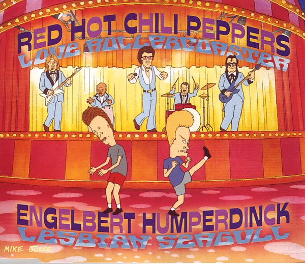 "Red Hot Chili Peppers - Love Rollercoaster" is an example of this where the band are draw up as cartoon characters in the style of the existing programme "Beavis and Butt-head", an adults cartoon TV programme. The video is based on this programme because the song is used in the soundtrack to the film, "Beavis and Butt-head Do America". This works well because people that already love the film or those characters will enjoy the video too, attracting an existing group of people as an audience.
The rollercoaster in this video amplifies the lyrics, representhing the theme of relationships and the theoretical ups and downs of them, reflected in the ups and downs of the ride and including alot of images of hearts and other love related shapes and objects throughout.
 Another completely animated video is to Junior Senior's song "Move Your Feet". In this video, the animation is used to enage the viewer, including random cartoon images that dance and move in time to the music, as from the point in Andrew Goodwin's theory that the music and visuals link, at somepoints it also links to the point about the relationship between the lyrics and visuals as the charactes are seen "moving their feet" as the song is about.
Being a dance song, the bold colours and shapes are in the appropriate style as if symbolising movement, disco and fun, (genre characteristics) similarly to the themes that dance music is associated with.
Subscribe to:
Posts (Atom)